Reimagined ADVANCE Center That Increased Visibility and Interest
Timeline: 5 months, 2017
Interview, Content Strategy, Information Architecture, Design and Frontend Development
The mission of the center changed from advancing women faculty in STEM career to faculty facilitation and leadership development. I teamed up with the director of the center to reimagine the new website.
My Role
I was the web designer and frontend developer but my role expanded to include content strategy and user experience as well.
Project Brief
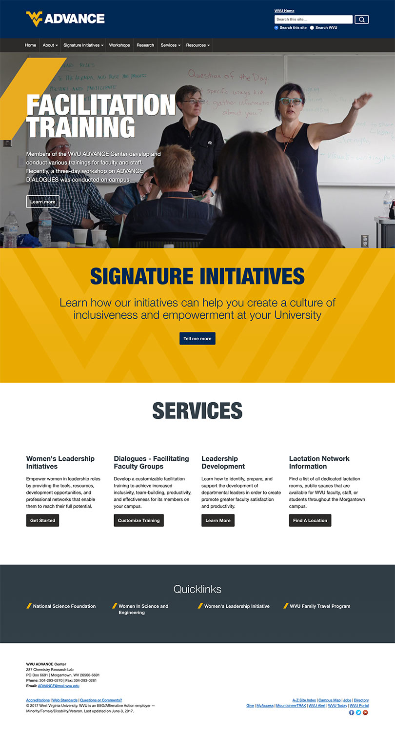
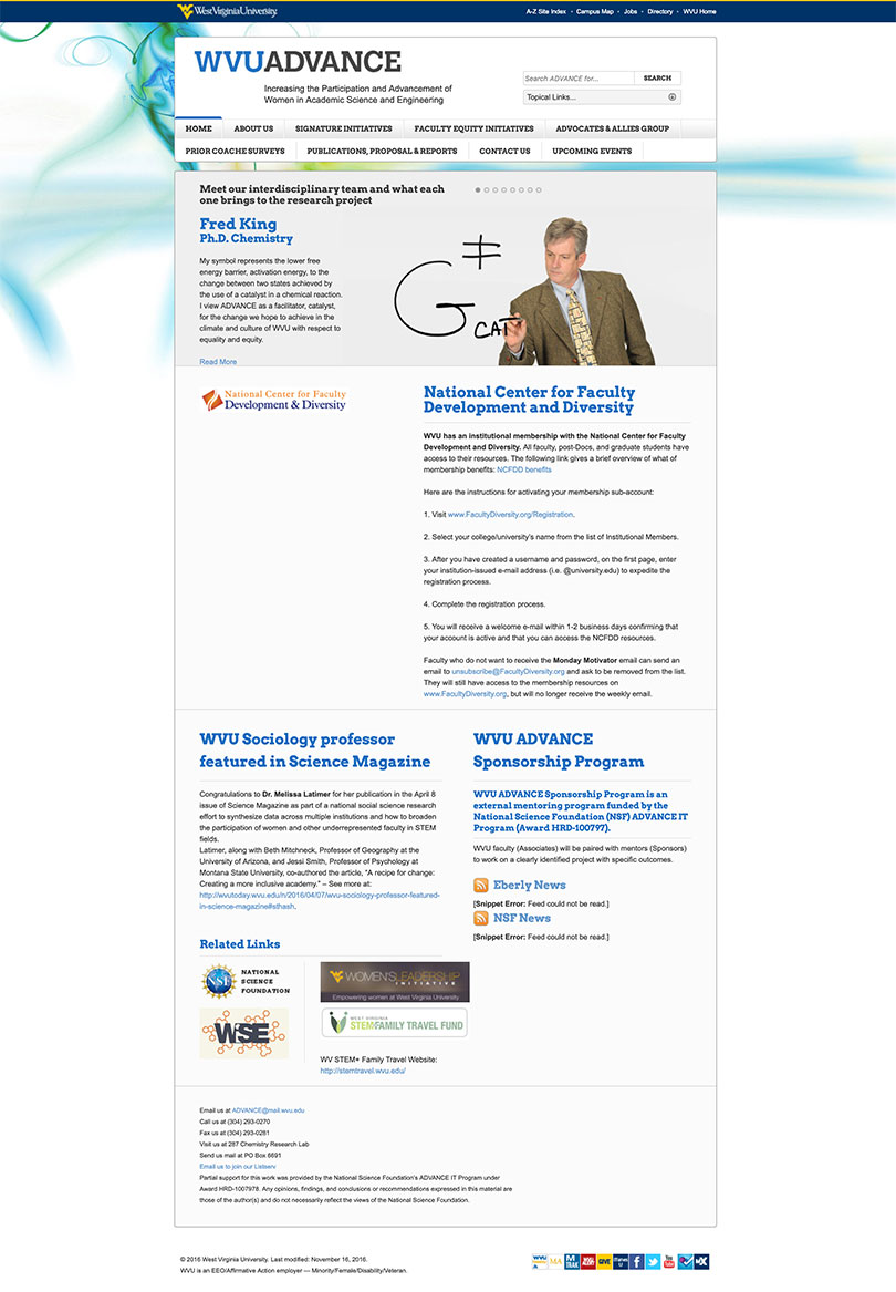
The original mission of the ADVANCE Center was to increase the participation and advancement of women faculty in science, technology, engineering, and math (STEM) careers at the university. However, that changed. Now, the center is focusing on faculty facilitation and leadership development programs. Therefore, a full redesign was necessary.
User Research
Stakeholder Interview
At the kickoff meeting with Dr. Melissa Latimer, director of the center, we determined that the new audience consisted of faculty members at both the university and other institutions. She wanted to highlight the workshops the center would be conducting. She also wanted to use the site to disseminate research papers and provide information for external agencies and government entities for funding.
Content Strategy
Because the center had a small staff, Melissa was also the content writer. As she has limited experience writing for the web, I offered her a few tips:
- Write in plain language
- Most people usually scan information, so write content in chunks. Incorporate headers and sub-headers liberally.
- Use bullet points
- Choose active voice and be conversational
- Provide diagrams and images to illustrate points
I also told her to imagine reading her content on a mobile phone. Did it feel like it was taking too long to read? If so, write more concisely.
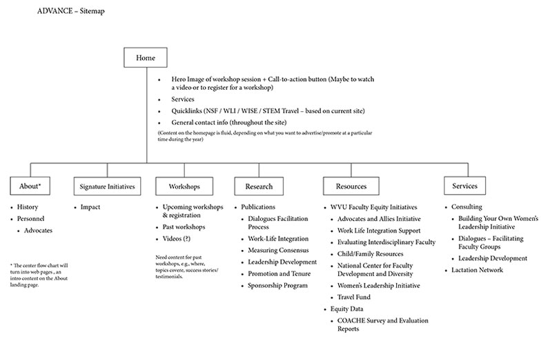
Information Architecture and Sitemap
Melissa had a lot of ideas on how she envisioned the site. Even though she wrote them down, I had a hard time understanding her. So, I suggested it would be easier to discuss her ideas on a whiteboard. This was productive because not only was she able to sketch out her ideas and improve on them, it also helped me fully understand terminologies and concepts.
After our whiteboard session, we were able to organize the content, fill in information gaps, create navigation, labels, and nail down the sitemap.
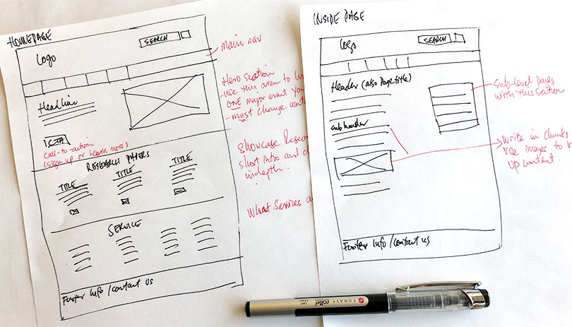
Wireframe
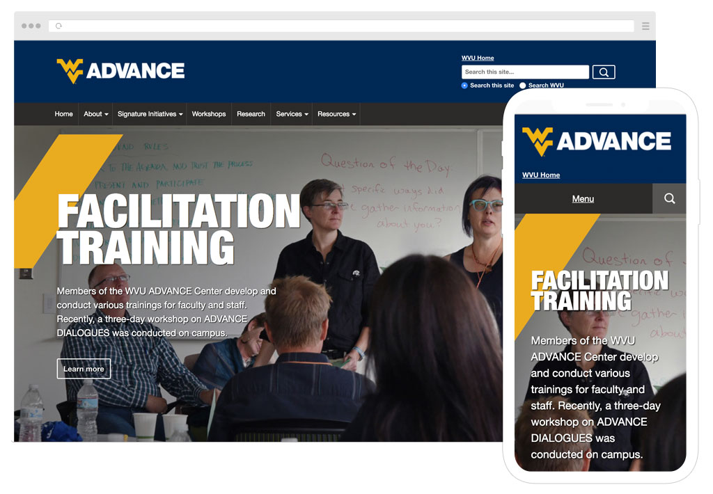
I began to sketch out the homepage and a couple of inside pages. Based on our discussion, I made sure to prioritize tasks and strategically place call-to-action buttons.
I showed the wireframe to Melissa and after a few changes, it was time to build the site.
Design and Development
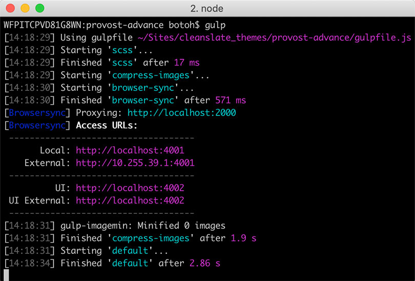
Since I was using the new university brand template, making the site in the CMS was a smooth process. To make my workflow productive and efficient, I used Gulp as a task runner for the first time. With Gulp, I could automate tasks such as compiling Sass files and converted them into a single CSS file, optimize images for performance, and test the site in different devices on a local machine.
Handing Off
Before the site went live, I onboarded the program coordinator on how to manage the site. I also provided guidance on web accessibility and the importance of writing for the web and used plain language.
The Outcome
Melissa was pleased with the new website because inquiries about the program increased after launch, resulting her team conducting four more workshops. She feels hopeful to get new funds in the future.