
Revamped Name Change Process That Increased Efficiency by 400%
Timeline: 2 months, 2022
UX Writing, Accessibility, Visual Design, Confirmation Emails
I was a member of a three-person technical team that revamped the name change process.
My Role
I was tasked to provide microcopy and email communication, help with visual design and ensure the app is accessible.
Project Brief
The University did not have a standardized name change process for people who wished to go by a different name:
- For students, it was time consuming. They must submit a PDF form to the Registrar’s Office who then sent it to Information Technology Services for their name to be entered into the student information system. Typically, this took about an average of four business days.
- For employees, the result was unpredictable. Although they could enter their name in an internal administrative system, it might not update across the university systems.
How might we make life easier for students and provide a consistent process and experience for everyone?
Solution
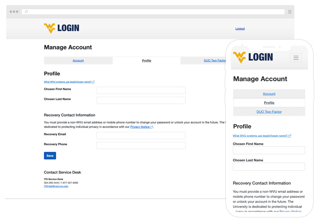
Create an online form in the identity management system for anyone at the university to easily change their name. After comparing against databases from both U.S. and international sources, approved names would then be stored in Identity Repository and sync across university systems. Names not found in the databases would undergo further review.
Remote Design Session
The project lead, developer and I met online to go through the design approach, timeframe, and direction. I was tasked with writing the UI copy, improving the app's visual design and interaction, and making sure it was accessible.
Understanding that a name was a person’s identity, I suggested the voice and tone of the validation messages should be respectful but direct, even if a vulgar name was submitted (yea, this happened before). So, we agreed to avoid words such as “invalid”, “inappropriate” and “unknown”, etc.
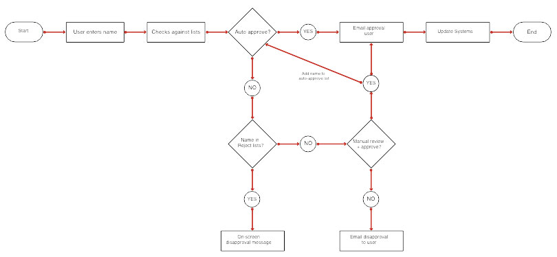
Flowchart Revealed Missing Steps
Even though the name change process had only three outcomes (approval, pending review and disapproval), I created a flowchart anyway to ensure we covered all the bases.
And boy, was I glad I did.
From the flowchart, I noticed we didn’t include the email confirmations to the process.
What We Learned From Usability Testing
Thinking we nailed the design, we sent it away for usability testing. Here were the results:
- Names with apostrophes (e.g., Ja'Nay) were not approved and any alphabet after an apostrophe or a space was automatically capitalized.
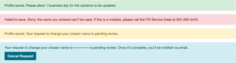
- Some people found the Approval and Pending Review messages confusing because both used the same green background color.
- Approved names were synced across the systems as designed.
The team regrouped and fixed the apostrophe issue by letting names to be saved exactly as entered. Then it occurred to me that people did not have a way to ask why their name was not approved. So, I added the service desk phone number in the Disapproved message.
As for the Pending Review banner, we changed the color from green to amber.
Before the project went live, I completed a final accessibility check.
The Outcome
The revamped process now takes only one business day for approved names to complete, an increase of 400% in efficiency! It proved to be well received because in the first month after launch, 129 people changed their names successfully, and the service desk did not receive any trouble tickets.
Students now list my name the way I prefer, because it is the way they see it on the email! My colleagues from outside the institution also list my name in my preferred format. Again, big thank you to whomever ushered this in.
— Julie Hicks Patrick, PhD
While we improved the process, some LGBTQ students questioned the use of “preferred name” on the form. To them, the name they wished to go by was their true name, not a preference nor an option. After discussing with the LGBTQ+ Center, we replaced “preferred” with “chosen” because it was a more inclusive term.
Lesson learned: Instead of designing for the users, we should be designing with them because involving a more diverse population will only make our products inclusive for all.